Analytics Overview
The Analytics dashboard gives you a complete picture of how your QR codes are performing — total scans, unique users, returning visitors, geographic breakdown, device types, and more. You can filter by QR code and export everything as a PDF report.
What does Analytics show?
- Summary stats — Total QR codes, Total Scans, Total Users, Returning Users
- Scans Statistics — line chart of Total Scans vs Unique Scans over time
- Users Statistics — line chart of Unique Users vs Returning Users over time
- Location breakdown — scans grouped by City, State, or Country with a donut chart
- Scan map — interactive map showing the exact locations of your scans
- OS & Browser breakdown — which operating systems and browsers your audience uses
- Export PDF — download all your analytics data as a PDF report
Analytics Overview & Scan Statistics
Click Analytics in the left sidebar to open the dashboard. At the top you will see four summary cards:
- Total QRs — the number of QR codes in your account
- Total Scans — all scans recorded across all your QR codes
- Total Users — unique visitors who scanned your codes
- Returning Users — visitors who scanned more than once
Below the cards, the Scans Statistics chart plots Total Scans and Unique Scans over time so you can spot trends and peak periods.
Use the Filter dropdown at the top to narrow the data to one or more specific QR codes. Click Export PDF to download a full PDF report of all the analytics data currently shown on the page.
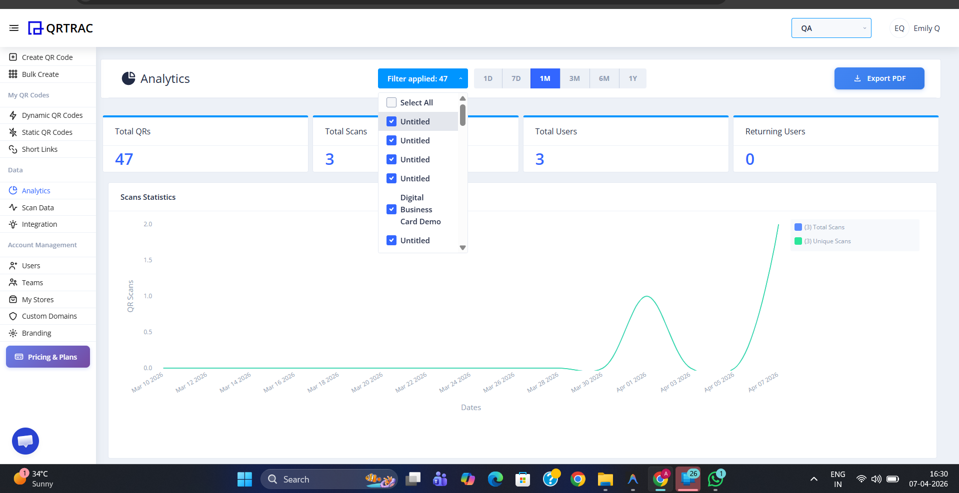
Analytics overview — summary cards, Scans Statistics chart, filter by QR code, and Export PDF
Tip: Click Export PDF in the top-right corner to download all your current analytics data — including charts and location data — as a formatted PDF report you can share with clients or stakeholders.
Users Statistics
Scroll down past the Scans Statistics chart to see the Users Statistics chart. This line graph compares Unique Users (new visitors) against Returning Users (people who scanned again) over the same time period. A rising Returning Users line indicates strong audience engagement with your QR codes.
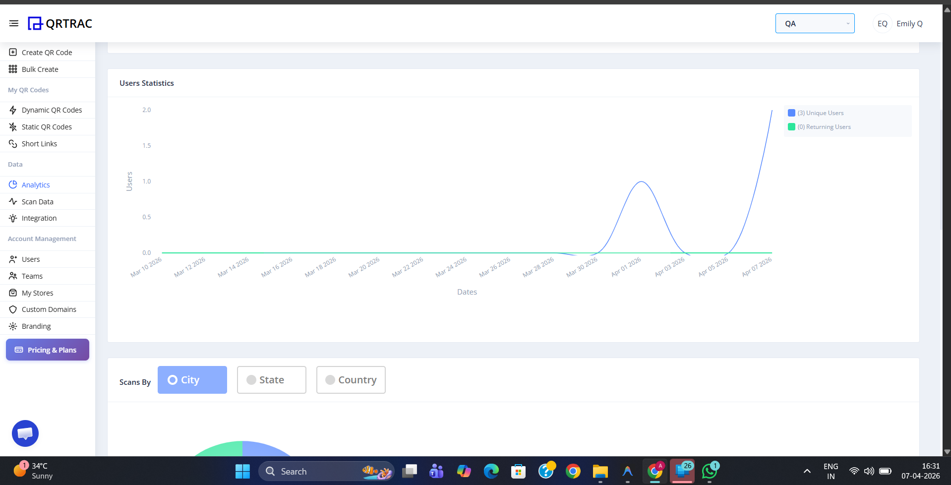
Users Statistics chart — compare unique vs returning visitors over time
Scans by Location
Below the Users Statistics chart, the Scans by Location section breaks down your scans geographically. Use the City, State, and Country toggle to switch between different levels of detail. A donut chart shows the proportion of scans from each location, with the total scan count in the centre.
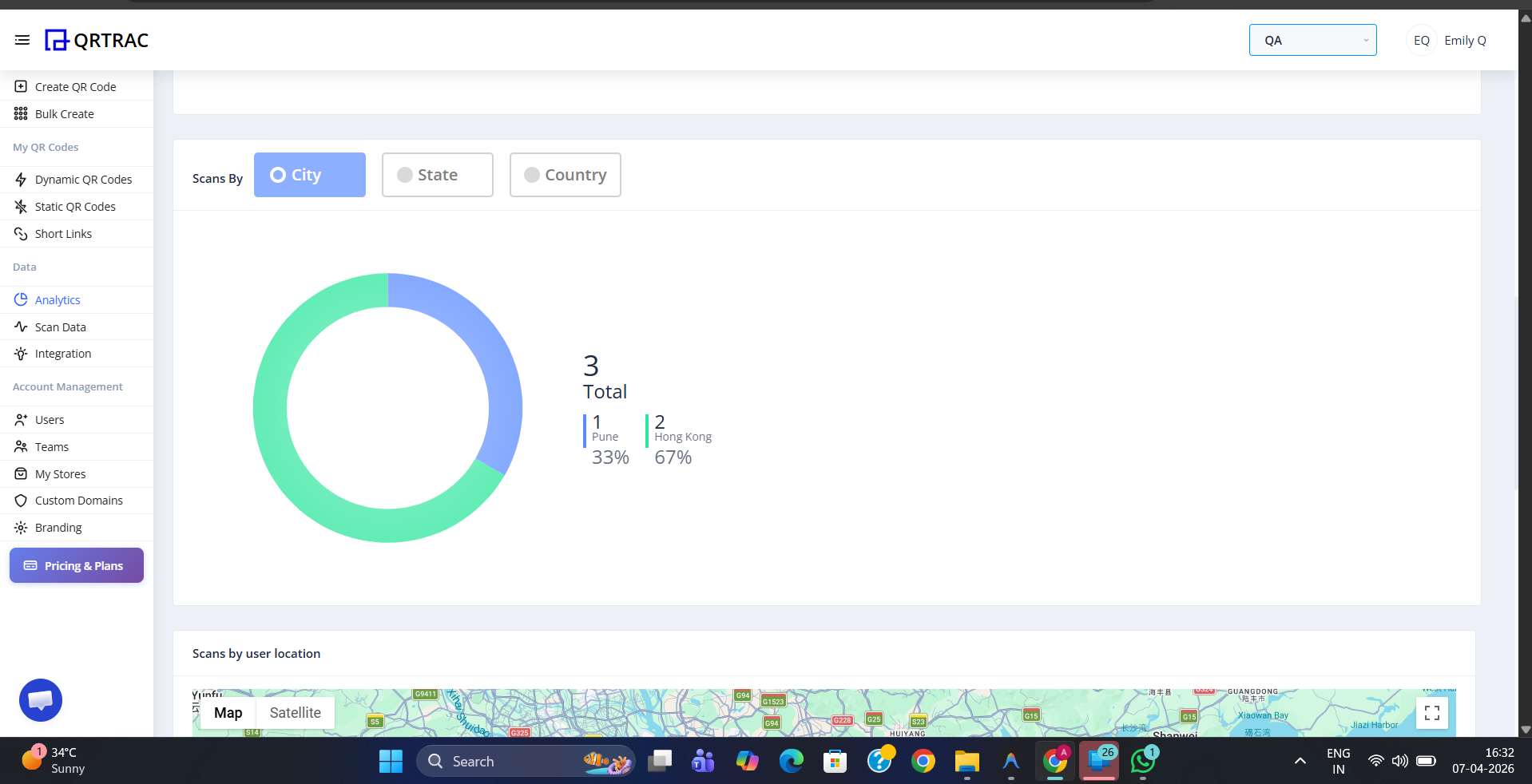
Toggle between City, State, and Country to see where your scans are coming from
Scans by User Location — Map
An interactive map plots every scan as a pin on the world map, showing you the exact locations where your QR codes were scanned. Switch between Map and Satellite views using the toggle in the top-left corner of the map. Zoom in to inspect specific areas in detail.
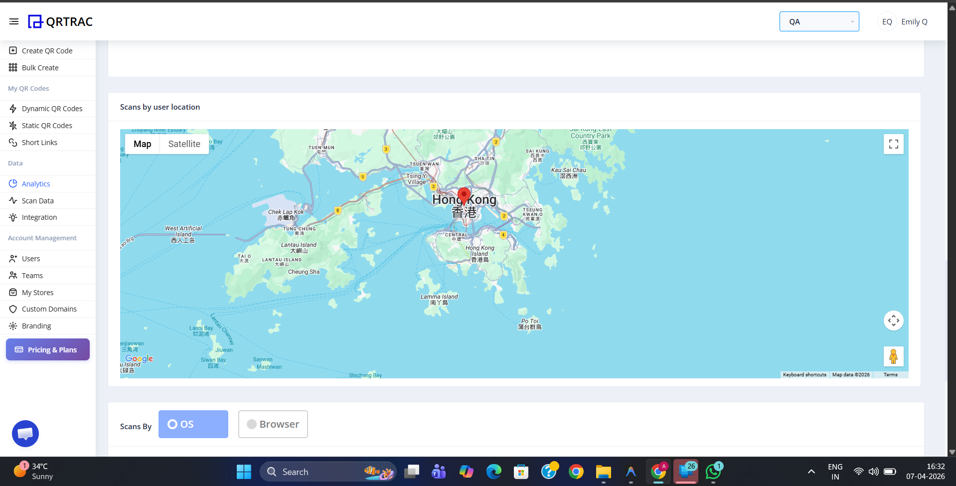
The scan map plots every scan as a pin — switch between Map and Satellite views
Scans by OS & Browser
Below the map, a donut chart shows the breakdown of scans by OS (operating system) or Browser. Use the toggle to switch between the two views. This tells you whether your audience is primarily on iOS, Android, Windows, or other platforms — and which browsers they use — so you can optimise your QR code landing pages accordingly.
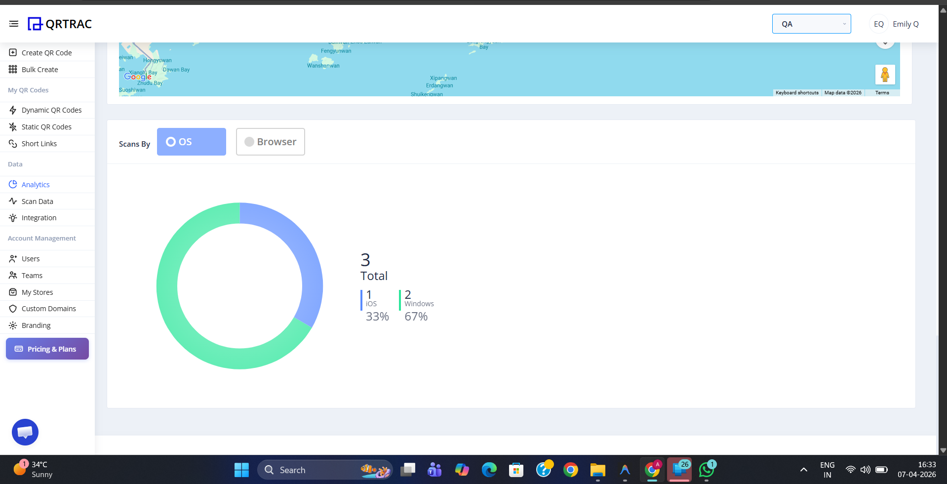
Switch between OS and Browser to understand what devices and browsers your audience uses
Analytics tracks Dynamic QR codes only
Scan tracking is available for Dynamic QR codes. Static QR codes do not record scan data as they have no server-side redirect to capture analytics.